Postcard17
5 weeks
Postcard17, an alternative/indie band from Kerala, approached me to create the album art for their song *Drop A Tear and Disappear.* The track explores themes of conflicting emotions, self-discovery, and fleeting time, which I aimed to visually represent through an evocative design.
The project began with an exploration of ideas reflecting the song’s emotional depth. Early sketches focused on themes of solitude, transformation, and disappearance, using abstract visual metaphors to communicate these ideas.


In the second and third iterations, the focus shifted towards a more surreal representation. The idea of a dissolving figure holding a frame was introduced, symbolizing detachment and introspection. Various poses and perspectives were explored to find the right balance of emotion and abstraction.
Further refinements led to the final character representation— a figure with a hollowed-out frame for a face, visually portraying the theme of self-identity and detachment. This approach allowed for a stronger emotional connection and reinforced the core message of the song.

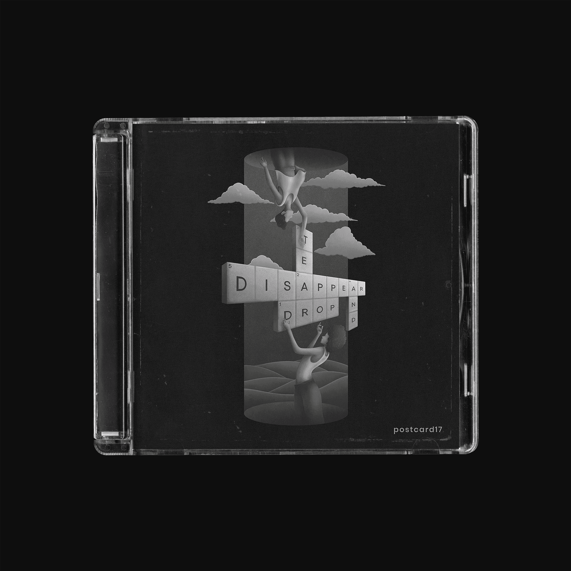
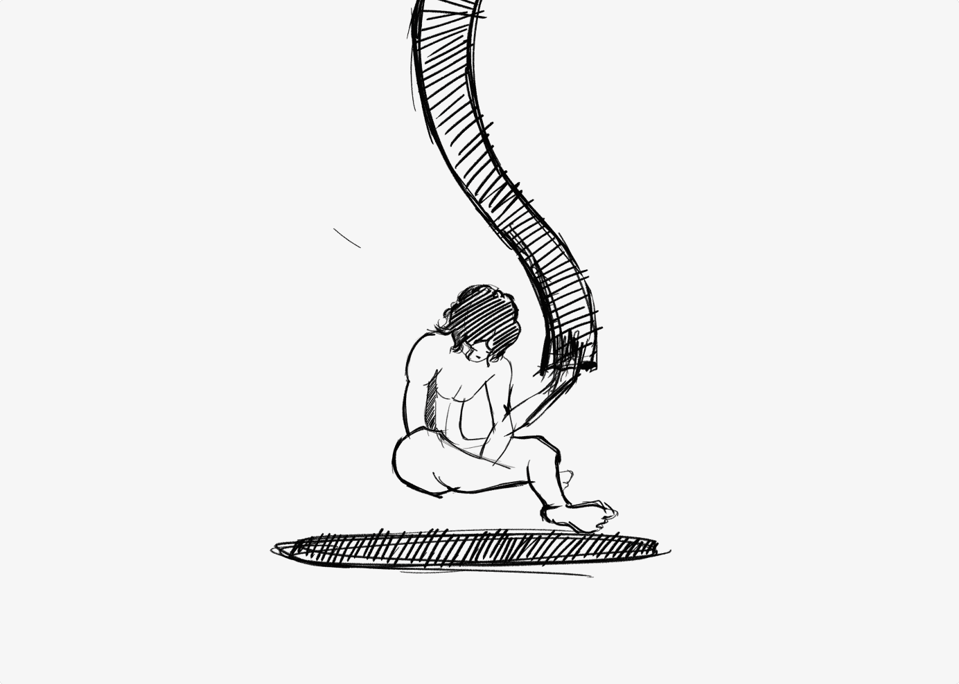
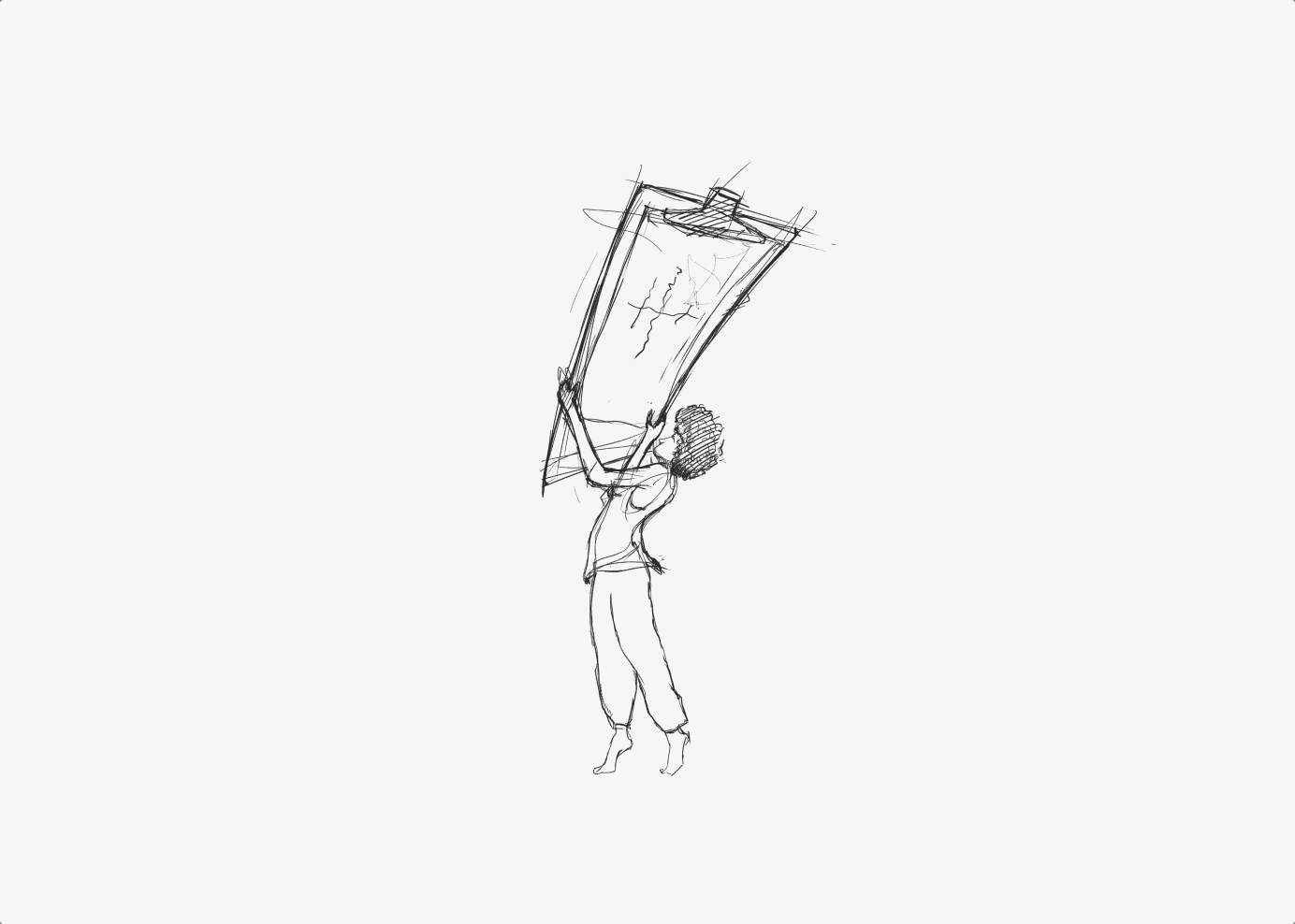
In subsequent iterations, the design incorporated two characters and introduced the idea of representing the song's name as a crossword puzzle. This concept aimed to engage the audience by challenging them to solve the puzzle while listening to the song. Each word in "Drop a tear and disappear" was assigned a numerical number, akin to a crossword puzzle.

To depict the themes of the song - pain and joy intertwining, simultaneous arrivals and departures, and the discovery and loss of self - the final iterations incorporated the concept of time as a tunnel. One person drops the crossword puzzle through a hole, representing the passing of time, while another person receives it from below and simultaneously disappears through another hole. This abstract representation captured the essence of life and the song's message.

The client requested the album art to follow the same color scheme as the song's video, ensuring visual consistency and connection between the music and the visual representation.


After the final iteration, the design process shifted to drawing proper outlines and shapes. Filling them with random colors provided an initial impression of the overall composition. To enhance the artwork, a tunnel of time was added, along with illustrations of random scenery in the background, reinforcing the sense of direction and gravity. The final stage involved painting over each shape and adding intricate details to bring the artwork to life.
