2months
Arka Design Studio (ADS) is a design team consisting of four technical individuals facilitating design and implementation solutions for the new prospective Client, by providing them with Architect's , Interior Designers and vendor contraction. ADS partners with product manufacturers and project managers to facilitate an end to end solution for the customer. I worked as a freelance graphic designer where my core responsibilities were branding, creating social media guidelines and creating a brand guideline book.

x
x
Concept 1
Architecture fundamentally revolves around the design of spaces and structures. With this logo, my aim was to represent the core essence of buildings through their elevation while seamlessly integrating the letters of the brand name "ARKA." The design resembles the side elevation of a cluster of high-rise buildings, emphasizing architectural form. The boldness of the logo conveys a sense of trust and strength, qualities essential for a growing brand. Since architecture demands utmost precision and dedication, evoking trust and stability in the visual identity is crucial.
Concept 2
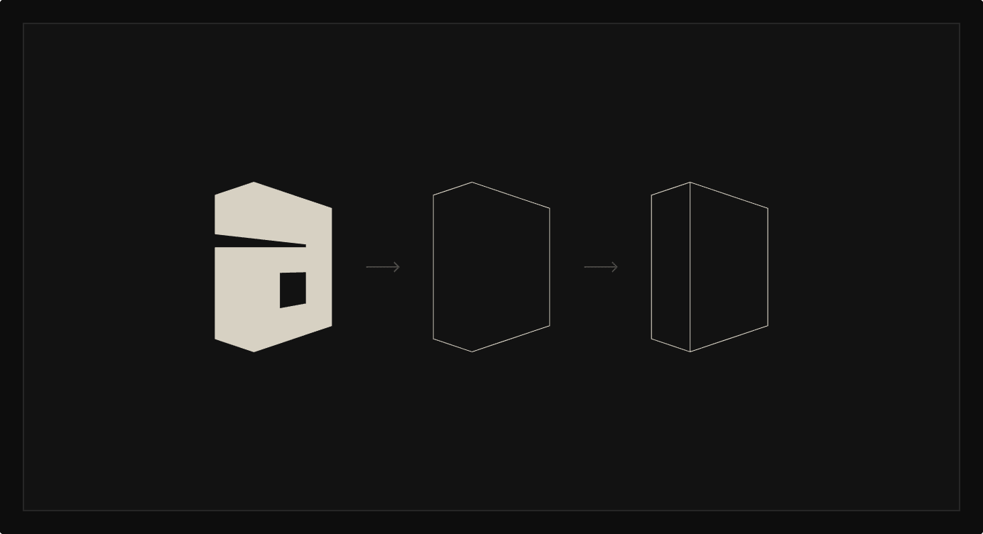
Architecture is the art and science of designing and shaping spaces and structures, distinct from the technical skills involved in construction. The concept behind this design was to craft the letter "A" in a way that resembles a rotated perspective of a building, complete with a window, merging form and function seamlessly.
Concept 3
"Arka" means the sun, inspiring the idea of crafting a form that merges the first letter, "A," with elements of the sun and its rays. The sun symbolizes power, positivity, and confidence, making it a fitting representation for the brand. By incorporating sunrays into the logo, the design evokes a sense of warmth, authenticity, and optimism, reinforcing the brand's genuine and uplifting identity.
Further developed concept 2 (selected by the client) by incorporating 2 point perspective lines while maintaining a 13x9 grid structure to achieve visual coherence. Furthermore the font “Helvetica now” was added to the logo to make the final logotype while keeping in mind about proper optical kerning.


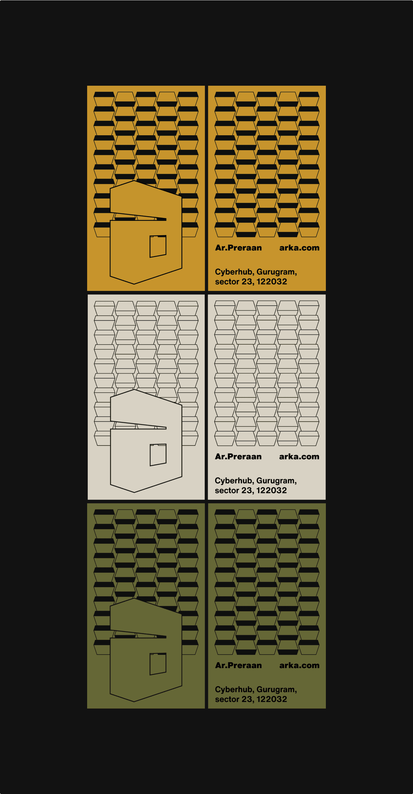
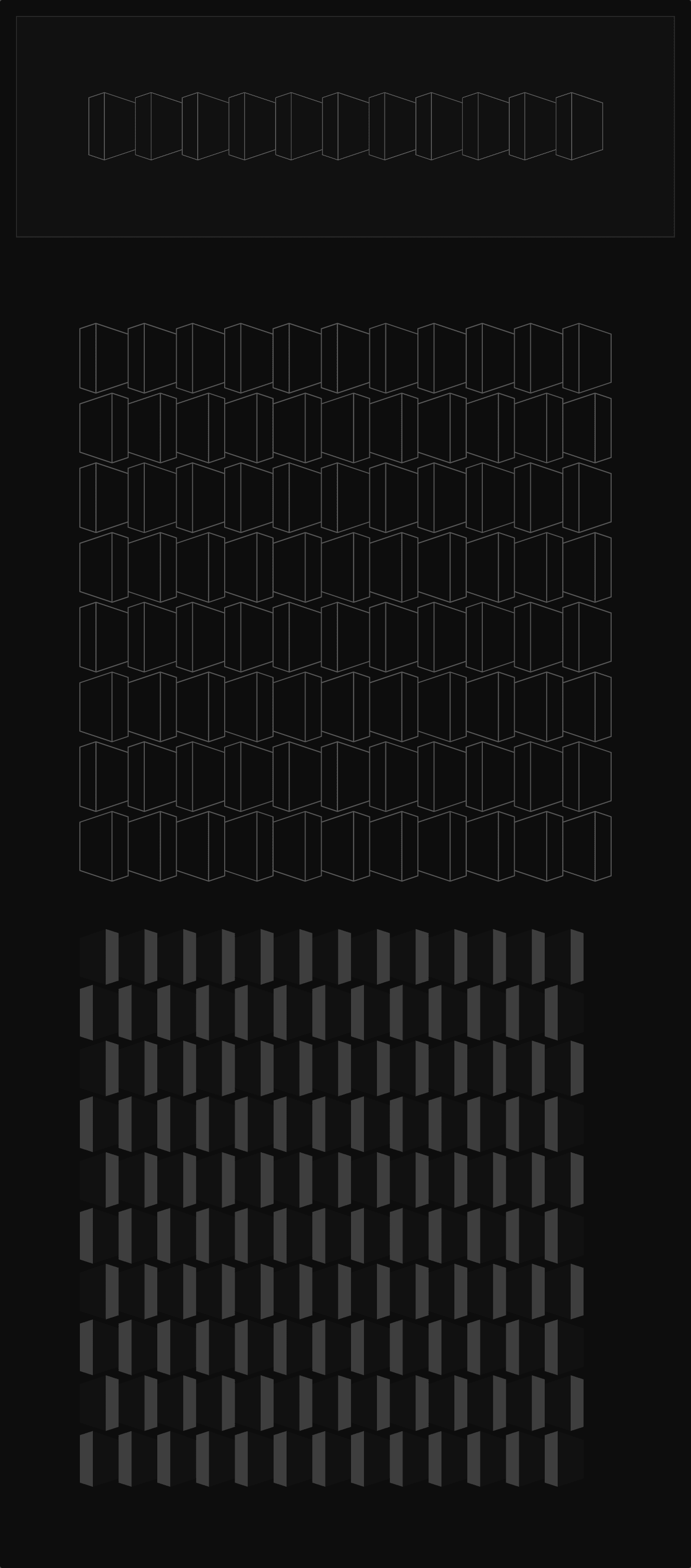
Patterns made from logo construction can be used as the secondary branded element.It can be used as a background overlay.
Designed business cards, tote bags and, invoice and personal dairy and letterhead incorporating the developed patterns, colors and typography